Changing the nib on one of these models is a piece of cake. The nib lies on the feed on a type of "rail". It slides on or off easily. Initially you might need to use the "scotch tape" method to remove the nib, meaning that you will stick a piece of tape to the nib and then pull it out by the tape. Brian Goulet has a great video explaining this very concept:
I have found that after you've swapped the nib a few times, the feed becomes less reluctant and allows you to remove the nib with your bare fingers. That's how I do it these days.
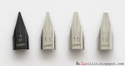
I bought my Lamy AL-Star with an EF nib but I really wanted to try their italic nibs so I bought the trio of italics in 1.1mm, 1.5mm and 1.9mm. Because these nibs are not exactly cheap I wanted to find the best deal on the web. At the time, my favorite store (no affiliation, just a satisfied customer, yada yada) didn't sell Lamy stuff so I found a UK company, The Writing Desk (no affiliation) which sold these nibs for a very good price. Including shipping, they cost less than what I would have paid here in the US.
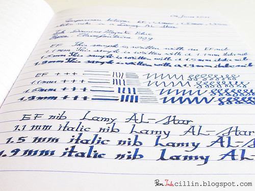
Anyhow, while the Lamy italic nibs are fun to use, I don't find myself using them a great deal but that's simply because I don't use my pens a lot these days. Here are some quick impressions on each of them. For this comparison I used Diamine Majestic Blue ink.
1.1mm italic
This nib is perhaps the easiest italic to get started with when you are lacking experience. Line variation is at a minimum and you can easily use this nib on a day-to-day basis.
1.5mm italic
Now you can start seeing some actual line variation. It becomes evident that an italic nib is used. This is perhaps my favorite size because it's neither too wide nor too narrow.
1.9mm italic
The biggest size is harder to use for quick writing so maybe it should be delegated to calligraphy duty. I found that, while all nibs flow really well, the 1.9mm needs to be held in good contact with the paper or else it can skip a little.

In summary, while I enjoy the 1.5mm the most for its mid-range variation, the 1.1mm is the easiest to write with, while the 1.9mm is more situational and is best used for calligraphy. With all italics I try to hold the nib at a 45 degree angle to the direction of writing. That seems to produce the best results.
One other thing that I have noticed is that italic nibs seem to make your handwriting look better. I have always written in cursive because that's how I was raised but my handwriting isn't the prettiest. Still, using an italic nib gives it a certain degree of polish, I would say. What do you think?

Thanks for the comparison! I would venture to say that the wide Lamys are geared to those of us who are fond of the Rotring Art Pens (especially the rare and coveted 2.7). The neat thing is that all those nibs work on both the long handled Joy and traditional size Safari/AlStar. My significant other really only uses italic nibs and swears by them.
ReplyDeleteOne thing I have noticed is that there are a couple of vendors who will sell the Lamy with whichever nib the customer desires. You don't have to buy a stock nib and the specialty one independently. I will happily give my dollars to the one stop shopping when possible :)
Happy writing everyone!
I was looking for a comparison like this because I got a Calligraphy set from Sheaffer and really liked the italic nibs, however the pens are not very comfortable to use and the cap does not close hermetically, making the ink dry. So I was thinking about getting a Lamy Vista with an itallic nib. I think it will be a 1.1 nib and I will get it from gouletpens. Great review!!!
ReplyDeleteThank you for sharing this. I have only tried the 1.1mm Lamy italic nib, and it was a customers that I was re-grinding to a smaller size.
ReplyDeleteI thought it was a pretty decent italic nib. My only 3 critiques for it were:
1) It's not a straight up italic, it's a cursive italic. I personally would appreciate it if companies would finally catch on to the naming systems used by FP people. It is an italic, but what kind? Stub, crisp, cursive? It's nice to know. :)
2) They seem to write smaller than the tipping is. Maybe it was the one that I tested, but the nib said 1.1mm, when it actually wrote about .8mm or .9mm. Not a huge deal...
3)The lack of tipping. I do wish they had some tipping, for the sake of wear/tear and time.
But then, they're only about $15.00 a piece, so who cares! These are really minor gripes any way.
I need to get myself a Lamy al-star (I love the brown one) someday, and try out the 1.9mm.
thanks for the review! i have found that Lamy nibs are rather inconsistent, with no EF (my usual choice) same as the other. I wish they would fix this.
ReplyDeleteThat may well be. My EF doesn't feel as fine as I would have expected.
ReplyDeleteI've got the 1.5mm nib and it is scratchy, it catches fibers in the tines and makes the ink looking like its feathering when its not. Any suggestions on how to fix this problem?
ReplyDeleteAll my Lamy italic nibs are very smooth. It sounds like you got a bad one. I'm not nib expert but I've picked up a few things from here and there. I would suggest looking at the nib with a loupe.
ReplyDeleteTry to determine if the tines are aligned properly, if the gap between them isn't too narrow or too wide and whether the tip is smooth or not. Also, try to drag a very thin film between the tines, just to make sure nothing is stuck between them. You might have paper fibers in there and not even know it. By "thin film" I mean something like 35mm film (which might still be a bit thick), or something even thinner. I use a feeler gauge http://www.amazon.com/25025-26-Blade-Master-Feeler-Gauge/dp/B000BYGIR4/ref=sr_1_1?s=automotive&ie=UTF8&qid=1323228553&sr=1-1 which is cheap and great for this sort of thing.
I am not an expert at pretty much anything, but I heard the increase In looking better is a mix of things. The line variation increases differences between similar letters, and the ending of letters are more visible.
ReplyDeleteThe 1.1mm nib is a good every day writer. Just be sure to use a drier ink (or one with irongall-content) or it will look like a simple broad line. Nearly all of my Lamy pens are equipped with der italic nibs (that said, there cheap ... 2,50 Euro per nib).
ReplyDeleteHmm, they must be cheaper in Europe then. Here in the US you can't find them for less than $10. I actually ordered mine from the UK because they were cheaper, even after adding shipping.
ReplyDeleteThanks for the comparison and the video. It was the 1.1 italic nib that got me back into the Safaris (after a baaaaad experience years ago with an M nib and pen that never wrote smooth, no matter what!)
ReplyDeleteThe nib makes a huge difference. I had issues with my EF initially but then it wrote very smoothly after I tweaked it a little. I use the 1.5mm now because it uses more ink and I can go quicker through my samples :)
ReplyDeleteHello, please let me know if it is possible to remove the feed of a Lamy Joy? I pulled it but it didn't come out.
ReplyDeleteHi sorry but I don't have experience with the Lamy Joy. However, since it has the same nib as the Safari/Vista/AL-Star I assume the nib is also the same, meaning that it can be pulled out if appropriate force is used. I suggest holding it with a piece of rubber, like an elastic band.
ReplyDeleteI recently caught a video of someone removing their nibs with the top of their caps. I believe Lamy designed the "X" groove on the top specifically to anchor the nibs (in particular the non-italic nibs with the rounded tips: EF, F, M, B). Cannot remember the link but I think it was probably on YouTube.
ReplyDeleteHmm that's intriguing. Would be nice if you could find that link. I was wondering what the X is for.
ReplyDeleteI'm sorry for the late reply -- here is a link: http://www.youtube.com/watch?v=YnyI_o0ly-o I stand corrected; the cap itself was used and not the X groove, as I took a closer look at the video once more and realized my mis-info above. The trick is to hold the cap down flush and firm. The X simply differentiates the fountain pen from their rollerballs, etc. Hope this helps.
ReplyDeleteThanks for this. I remove my nibs with my fingers, they loosen up after changing them a couple of times.
ReplyDeleteOne way to upgrade those Sheaffer calligraphy pens is to empty the cartridges of the lousy ink they come with and use a syringe to fill them with something better, or get a Sheaffer converter. I put Noodler's HOD into my 3 ancient Sheaffers (F, M & B) and got better flow, better starting and better lines. I still wonder if Lamy Calli nibs or Goulet Pens Calli nibs would be better, smoother than these Sheaffers. I just tried making some labels with the Broad Sheaffer and it was scratching, more like stumbling, on the downward right-curving strokes
ReplyDeleteI'm curious about Goulet nibs too.
ReplyDeleteLamy pens are great, I love their designs but i've never really paid much attention to the nib size or how that affects the writing. I just get standard ones because I don't use them for calligraphy or any fancy writing, just general writing.
ReplyDelete