I had set my sights on this ink even before I got into fountain pens. From various reviews I came to the understanding that this is one of the best shading inks out there. Not only that but it was supposed to be produced in limited quantities because it celebrates 340 years of J Herbin's existence. That's an amazing feat on its own, after all, how many companies are still in business after 300 years? Well, J Herbin, a French company, are still at it and they took this opportunity to produce an ink with unique properties and a uniquely designed bottle.
Unfortunately I botched some of the photos I took of the packaging so I only have a decent photo of the actual bottle, leaving the cardboard box out.
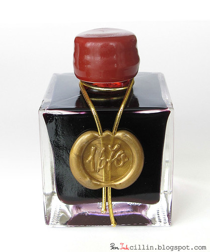
As you can see, the bottle has a very interesting design. It is roughly cubic-shaped and made from thick glass. The cap is coated in a red wax-like material, which is real wax if I'm not mistaken. Initial batches of the ink had some issues with this coating which crumbled easily when handled but J Herbin changed the formula and the version I got has no such problems. The cap is slightly flimsy though (it's made from very thin metal) so be careful not to squeeze it too hard.
The bottle itself is tinier than anticipated and feels positively dainty. I was really expecting a larger bottle but it impressed me nonetheless with its delicate appearance. The bottle holds 50ml or about 1.69oz.
The coup de grâce (if I may poach a French expression) is the nicely done golden seal at the front of the bottle, embossed with the 1670 logo. The seals are all applied by hand and there's a video somewhere on the web showing the process but unfortunately I can't find it anymore.
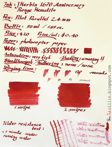
J Herbin 1670 is an expensive ink. The only other fountain pen ink that I know of which is more expensive than 1670 is the range of Iroshizuku inks. Considering the packaging, the limited quantities and the ink's qualities, I would say that the price is justified. The price per milliliter comes to $0.40 (the bottle itself cost me $20) and this is much more expensive than, say, Noodler's inks which generally cost $0.14 per milliliter.
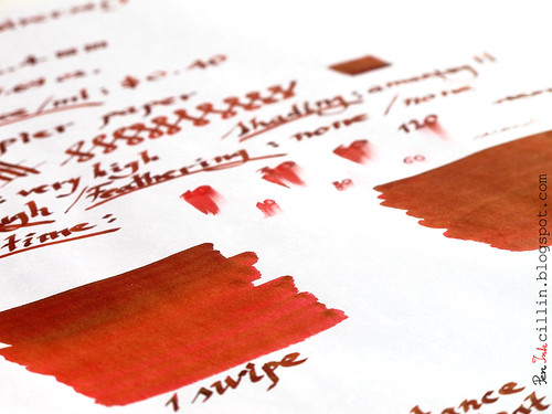
Let me talk for a second about the name. J Herbin 1670 Anniversary Rouge Hematite is the full name and while the "J Herbin 1670 Anniversary" part is self-explanatory, I will offer my own theory about "Rouge Hematite". First, Rouge is French for "red. Second, Hematite almost certainly refers to the strong shading this ink exhibits. Hematite is the mineral from which iron is extracted. Take a look at the rock's color and then look at the samples farther down. Yup, it's a match.
Before the review proper, a word of caution. Some folks have expressed frustration with this ink, claiming that it settles in the bottle and it is hard to use in a fountain pen as a result. Yes, it is true that it settles. The "hematite" component, which seems to be heavier, separates from the red and settles on the bottom of the bottle. Thus, before using the ink, it is mandatory to shake the bottle well for a few minutes. Keep watching the bottom of the bottle until it becomes clear. This is a known fact about 1670 and it is a consequence of how the ink's components are mixed together. Just bear this in mind if you ever want to use this ink.
My humble opinion is that such an ink shouldn't be used merely for writing. Instead, it is much better suited for calligraphy and/or art. The reason is that the powerful shading is more evident with wider swaths of color and a thin nib wouldn't be able to show it off to the best advantage.
Hence, I loaded this ink in an empty Pilot cartridge and used it in my Pilot Parallel calligraphy pen with 2.4mm nib. Please excuse my poor attempts at pseudo-calligraphy but, in my defense, it's the ink that's on trial, not my writing skills.
J Herbin 1670 Rouge Hematite is a saturated red, very similar in color with Noodler's Nikita which I have reviewed previously, especially when wet. When it dries up, it retains more vibrancy than the Nikita.
It hardly bleeds when applied normally with the pen, nor does it feather. It flows very well but then again, the Pilot Parallel pens have very good flow.
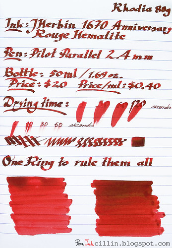
Drying times are very slow. It took ages for the ink to dry, even on the more absorbent photocopier paper. This is due in part to the very wet and wide line drawn by the Pilot Parallel. I also timed drying times by writing with the thin side of the nib. Although shorter, it still takes at least 30 seconds for the ink to dry. Considering that I wouldn't use J Herbin 1670 to write, these times are acceptable for drawing.
One side-effect of this ink is that it tends to smear if touched, even after it has dried well. I learned that the hard way after accidentally touching a drawing I had done on a birthday card for my dad.
Surprisingly, there seems to be a small amount of water resistance to J Herbin 1670 Rouge Hematite. After holding the sample about a minute under a running faucet, most of the dark color has washed off but the text is still very much legible. What's left behind is pink instead of red so I'm assuming it's part of the "Rouge" component, rather than the "Hematite".
Moving on to the most exciting feature of J Herbin's 1670, the shading is the most beautiful I have experienced so far in an ink. It is best seen on wider swaths of ink and when the paper is tilted towards the light. This is where the golden tones start shining and it's a wonderful thing to see. It literally makes the ink come alive. Thanks to this, it gives the ink a very warm shade of red. There are, of course, hints of orange in there and visions of a fiery sunset come to mind.
To wrap up, J Herbin 1670 Anniversary Rouge Hematite is a very delightful red ink with gorgeous golden shading, particularly well suited for artistic endeavors. It is just as usable for loading in a fountain pen for writing, thanks to its vibrant, saturated shade of red. Drying times are slow, especially when the nib is wet but to compensate, it shows a little bit of water resistance. The bottle is a work of art in itself and if you're worried that this ink might disappear forever, there are hints that J Herbin will continue to produce it, albeit in a less interesting bottle. If the price does not scare you, I highly recommend a bottle.
Here are two samples, written on plain photocopier paper and Rhodia 80g.

Really liked your review of 1670 :) Also your writing looks good with the parallel pen.
ReplyDeleteThanks Gentian! You are too kind, my writing is all over the place. There's no discipline, no control. It's just what I cooked up, having no training in calligraphy whatsoever.
ReplyDeleteJust so you know, this is an ink that I got a sample of from Goulet Pens, and though it's very pretty, it does stain the inside of the sample bottle. After the North African Violet debacle, I thought you might like a heads up.
ReplyDeleteI've used it in a recycled Pilot cartridge and it hasn't stained that one at all, nor the pen itself. Further, I refilled the cartridge with yellow ink after I used up all the 1670 and there hasn't been any contamination. At any rare, thanks for the heads-up, I'll be careful not to use it in one of my demonstrators.
ReplyDeleteA wonderfully written and demonstrated review. You make the ink sound like a "must have" but I will try to refrain from any ink purchase until I evaluate what I have and what I can sell or give away.
ReplyDeleteMany thanks.
Thanks! It's a "must have" depending how crazy you are about inks, what your use for this ink is and whether J Herbin will keep producing it or not. There are much cheaper inks out there but, as far as I'm aware, none of them have this gorgeous shading. On the other hand, Nikita is a very nice red, minus the shading but much cheaper.
ReplyDeleteI'm guilty myself of buying more inks than I'll end up using but I already know that I'll buy one or two more bottles of "gotta have it" ink.
1670 is, for the moment, gathering dust because I'm not sure what to use it for. So yeah, in many ways this was an emotional purchase :)
I found the link for how the seal is made.
ReplyDeletehttp://www.youtube.com/watch?v=OxDg6w8-7fo
Oh yeah, I saw this one but thanks for posting it here for everyone who might be interested.
ReplyDeleteNice post thanks for sharinng
ReplyDelete